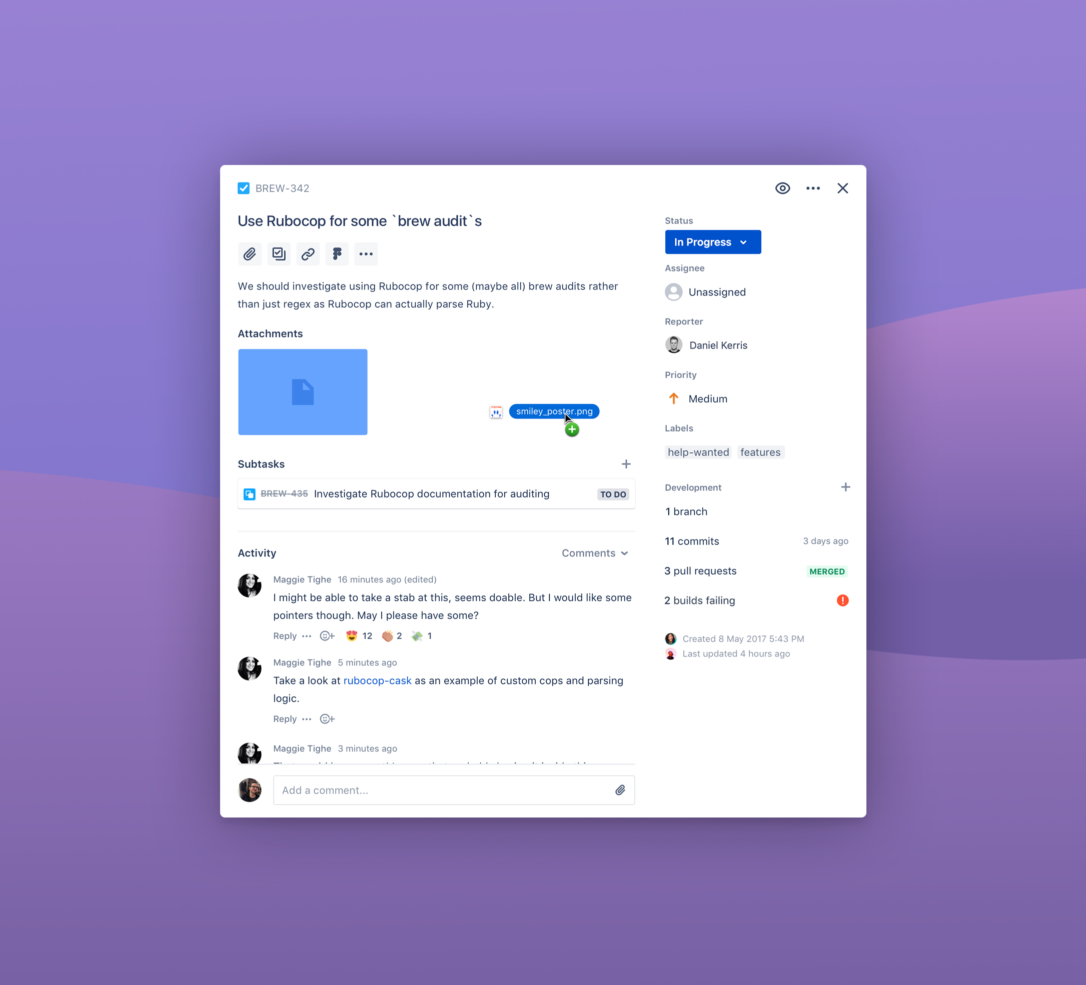
The Jira issue view redesign was initiated to address user experience challenges in Jira highlighted by user feedback. The project catered to both Jira users who needed a more efficient and user-friendly interface, as well as power users that had dense configurations.
The project aimed to tackle identified pain points like a cluttered interface, information overload, and lack of intuitive control over how issues were rendered.
The project's vision was to transform one of the most viewed screens in all of Jira into:
